> For the complete documentation index, see [llms.txt](https://themessupport.gitbook.io/lollipop-theme/llms.txt). Markdown versions of documentation pages are available by appending `.md` to page URLs; this page is available as [Markdown](https://themessupport.gitbook.io/lollipop-theme/inner-pages/product-information.md).

# Product information

Displays the product media, details, purchasing options, and related product information on the product page.

## How to access

1. Go to **Shopify Admin → Online Store → Themes**.
2. Click **Customize** on your active theme.
3. Open a **Product** template.
4. Select the **Product information** section.

## Section Settings

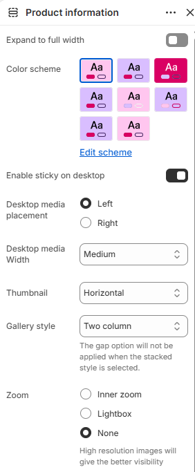
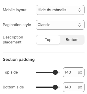
<div><figure><img src="/files/53abIXxWGVtbAf7dvdo3" alt=""><figcaption></figcaption></figure> <figure><img src="/files/mKIVBU8yR9i5nO49mUey" alt=""><figcaption></figcaption></figure></div>

| Setting                  | Description                                                                                                                                    |
| ------------------------ | ---------------------------------------------------------------------------------------------------------------------------------------------- |
| Expand to full width     | Extends the section to the full browser width.                                                                                                 |
| Color scheme             | Sets the background and text colors.                                                                                                           |
| Enable sticky on desktop | Keeps the product information visible while scrolling on desktop.                                                                              |
| Desktop media placement  | Displays the product media on the Left or Right.                                                                                               |
| Desktop media width      | Sets the media width. Choose from Small, Medium, or Large.                                                                                     |
| Thumbnail                | Sets the thumbnail layout.                                                                                                                     |
| Gallery style            | Sets the product gallery layout. Choose from Two column or Stacked. **Note:** The **Gap** setting is not applied when **Stacked** is selected. |
| Zoom                     | Sets the image zoom behavior. Choose from Inner zoom, Lightbox, or None.                                                                       |
| Mobile layout            | Sets the product gallery layout on mobile. Choose from Hide thumbnails or Show thumbnails.                                                     |
| Pagination style         | Sets the pagination style. Choose from Classic or Modern.                                                                                      |
| Description placement    | Displays the product description at the Top or Bottom.                                                                                         |
| Top side                 | Space above the section.                                                                                                                       |
| Bottom side              | Space below the section.                                                                                                                       |

## Blocks

Add blocks to this section in the theme editor. Each block adds a different type of product information. You can add, remove, and reorder blocks to customize the product page.

| Block                      | Description                                                                                                                                                                                                                                                                                                                                                                                                                                                                                                                                                                         |
| -------------------------- | ----------------------------------------------------------------------------------------------------------------------------------------------------------------------------------------------------------------------------------------------------------------------------------------------------------------------------------------------------------------------------------------------------------------------------------------------------------------------------------------------------------------------------------------------------------------------------------- |
| **Vendor**                 | Displays the product vendor.                                                                                                                                                                                                                                                                                                                                                                                                                                                                                                                                                        |
| **Title**                  | Displays the product title.                                                                                                                                                                                                                                                                                                                                                                                                                                                                                                                                                         |
| **Price**                  | Displays the product price.                                                                                                                                                                                                                                                                                                                                                                                                                                                                                                                                                         |
| **Text**                   | Adds custom text to the product information. Customize the **Text**.                                                                                                                                                                                                                                                                                                                                                                                                                                                                                                                |
| **Icon with text**         | <p>Displays a row of icons with optional headings to highlight key product features, benefits, or services.</p><ul><li><strong>Item 1–4</strong> – Configure each icon item independently.</li><li><strong>Icon</strong> – Select a predefined icon from the available icon library.</li><li><strong>Image</strong> – Upload a custom icon image to replace the predefined icon.</li><li><strong>Heading</strong> – Adds a short title displayed with the icon.</li></ul>                                                                                                           |
| **Variant selector**       | <p>Displays the product variant options, such as size, color, or style, allowing customers to choose the desired product option before adding it to the cart.</p><ul><li><strong>Option style</strong> – Displays variant options as <strong>Dropdown</strong> or <strong>Button</strong>.</li><li><strong>Swatch type</strong> – Displays button-style variants as <strong>Color</strong>, <strong>Image</strong>, or <strong>Text</strong>.</li><li><strong>Swatch shape</strong> – Sets the button swatch shape to <strong>Rounded</strong> or <strong>Boxed</strong>.</li></ul> |
| **Quantity**               | Displays the quantity selector.                                                                                                                                                                                                                                                                                                                                                                                                                                                                                                                                                     |
| **Buy buttons**            | <p>Displays the primary purchase actions, including the Add to cart button and optional accelerated checkout button.</p><ul><li><strong>Show dynamic checkout buttons</strong> – Displays an accelerated checkout button using the customer's preferred payment method, such as Shop Pay, Apple Pay, or PayPal.</li><li><strong>Show recipient information form for gift cards</strong> – Displays a form that allows customers to send gift cards directly to recipients with an optional personal message.</li></ul>                                                              |
| **Pickup availability**    | Displays pickup availability information.                                                                                                                                                                                                                                                                                                                                                                                                                                                                                                                                           |
| **Accordion panel**        | <p>Displays an expandable panel for organizing additional product information, such as specifications, shipping details, or care instructions.</p><ul><li><strong>Heading</strong> – Sets the heading displayed for the accordion panel.</li><li><strong>Content</strong> – Adds custom text or rich text content displayed inside the accordion panel.</li><li><strong>Page</strong> – Displays the content from a selected page inside the accordion panel.</li><li><strong>Open by default</strong> – Expands the accordion panel when the product page loads.</li></ul>         |
| **Usage information**      | <p>Displays an expandable panel for providing usage instructions or additional information about the product.</p><ul><li><strong>Title</strong> – Sets the heading displayed for the usage information panel.</li><li><strong>Open by default</strong> – Expands the usage information panel when the product page loads.</li></ul>                                                                                                                                                                                                                                                 |
| **Description**            | <p>Displays the product description and controls how it is presented on the product page.</p><ul><li><strong>Style</strong> – Sets how the product description is displayed: Default, Offcanvas, or Collapse.</li><li><strong>Open by default</strong> – Expands the description automatically when the <strong>Collapse</strong> style is selected.</li></ul>                                                                                                                                                                                                                      |
| **Complementary products** | <p>Displays a list of recommended products related to the current product to encourage additional purchases.</p><ul><li><strong>Heading</strong> – Sets the heading displayed above the complementary products.</li><li><strong>Maximum products to show</strong> – Sets the maximum number of complementary products displayed.</li><li><strong>Enable carousel</strong> – Displays the complementary products in a carousel.</li><li><strong>Next/Previous arrows</strong> – Shows navigation arrows for the carousel.</li></ul>                                                  |
| **Modal text**             | <p>Displays a button or link that opens additional information in a modal window.</p><ul><li><strong>Label</strong> – Sets the text displayed for the modal trigger.</li><li><strong>Page</strong> – Selects the page whose content is displayed in the modal.</li></ul>                                                                                                                                                                                                                                                                                                            |
| **Canvas panel**           | <p>Displays additional product information inside an off-canvas panel that opens when triggered.</p><ul><li><strong>Heading</strong> – Sets the heading displayed for the canvas panel.</li><li><strong>Content</strong> – Adds custom text or rich text content displayed inside the canvas panel.</li><li><strong>Page</strong> – Displays the content from a selected page inside the canvas panel.</li></ul>                                                                                                                                                                    |
| **Trust icon**             | <p>Displays a grid of trust icons with optional text to highlight product features, guarantees, or services.</p><ul><li><strong>Item 1–4</strong> – Configure each trust icon independently.</li><li><strong>Icon</strong> – Select a predefined icon from the available icon library.</li><li><strong>Image</strong> – Upload a custom icon image to replace the predefined icon.</li><li><strong>Text</strong> – Adds descriptive text displayed below the icon.</li></ul>                                                                                                        |
| **Share**                  | <p>Adds a share button that lets customers share the product page.</p><ul><li><strong>Text</strong> – Sets the label displayed for the share button.</li></ul>                                                                                                                                                                                                                                                                                                                                                                                                                      |
| **Sticky cart**            | Keeps the product purchase actions visible while customers scroll, making it easier to add the product to the cart without returning to the main product information.                                                                                                                                                                                                                                                                                                                                                                                                               |
| **SKU**                    | Displays the product SKU (Stock Keeping Unit) assigned to the selected product variant.                                                                                                                                                                                                                                                                                                                                                                                                                                                                                             |
| **Custom liquid**          | <p>Displays custom Liquid code on the product page for advanced storefront customizations.</p><ul><li><strong>Liquid code</strong> – Enter custom Liquid code to display dynamic content or app snippets.</li></ul>                                                                                                                                                                                                                                                                                                                                                                 |