| Collection | Selects the collection to display in this section. |
| Tab style | Sets how customers switch between collections when multiple collections are available. Choose from Tabs or Dropdown. |
| Layout | |
| Expand to full width | Extends the section to the full browser width. |
| Color scheme | Sets the background and text colors. |
| Background opacity | Controls the background opacity. |
| Content | |
| Heading | Sets the section heading text. |
| Heading size | Controls the size of the heading. |
| Text | Adds supporting text to the section. |
| Text position | Shows the text above or below the heading. |
| Desktop content alignment | Aligns the section content on desktop. Choose from Left, Center, or Right. On mobile, the content is automatically centered. |
| Product card | |
| Show vendor | Displays the product vendor on each product card. |
| Show description | Displays the product description on each product card. |
| Show card swatch | Displays color or variant swatches on the product card. |
| Show secondary image on hover | Displays the second product image when customers hover over the product card. |
| Show quick add option | Displays a quick add button on the product card. |
| Column alignment | Aligns the product card content. Choose from Left, Center, or Right. |
| Aspect ratio | Sets the image proportions for product cards. Choose from Portrait, Square, or Adapt to image. |
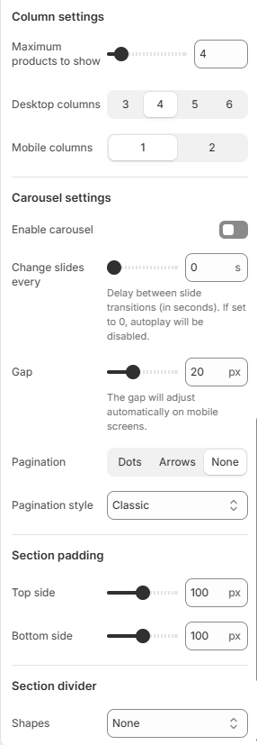
| Column settings | |
| Maximum products to show | Sets the maximum number of products displayed from the selected collection. |
| Desktop columns | Sets the number of products displayed per row on desktop. Choose from 3, 4, 5, or 6. |
| Mobile columns | Sets the number of products displayed per row on mobile. Choose from 1 or 2. |
| Carousel settings | |
| Enable carousel | Displays the products in a carousel layout. |
| Change slides every | Sets the delay between automatic slide transitions. Enter 0 to disable autoplay. |
| Gap | Controls the spacing between product cards. |
| Pagination | Sets the carousel navigation style. Choose from Dots, Arrows, or None. |
| Pagination style | Sets the appearance of the carousel navigation. Choose from the available pagination styles. |
| Section padding | |
| Top side | Sets the space above the section. |
| Bottom side | Sets the space below the section. |
| Section divider | |
| Shapes | Adds a decorative divider to the section. Choose from Curve top, Curve bottom, Curve both, None, Border top, Border bottom, or Both border. |
.png?alt=media)
.png?alt=media)