> For the complete documentation index, see [llms.txt](https://themessupport.gitbook.io/lollipop-theme/llms.txt). Markdown versions of documentation pages are available by appending `.md` to page URLs; this page is available as [Markdown](https://themessupport.gitbook.io/lollipop-theme/sections/image-banner.md).
# Image banner
Displays one or two banner images with customizable content overlaid on the images.
## How to access
1. **Go to** Shopify Admin → Online Store → Themes.
2. **Click** Customize on your active theme.
3. Click **Add section** and choose **Image banner**.
## Section Settings
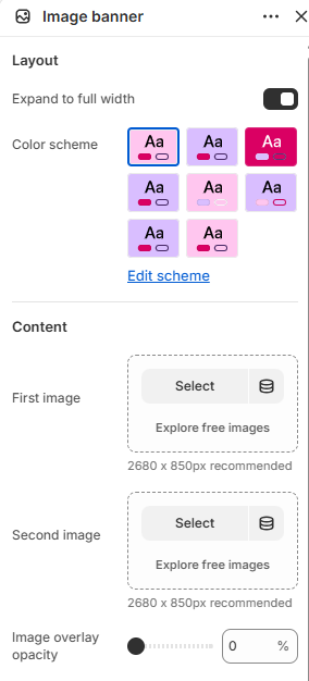
| Setting | Description |
| ------------------------- | ------------------------------------------------------------------------------------------------------------------------------------------- |
| **Layout** | |
| Expand to full width | Extends the section to the full browser width. |
| Color scheme | Sets the background and text colors. |
| **Content** | |
| First image | Selects the first banner image. |
| Second image | Selects the second banner image. |
| Image overlay opacity | Controls the opacity of the image overlay. |
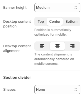
| Banner height | Controls the banner height. Choose from Adapt to image, Small, Medium or Large |
| Desktop content position | Positions the content vertically on desktop. Choose from Top, Center, or Bottom. |
| Desktop content alignment | Aligns the content on desktop. Choose from Left, Center, or Right. On mobile, the content is automatically centered. |
| **Section divider** | |
| Shapes | Adds a decorative divider to the section. Choose from Curve top, Curve bottom, Curve both, None, Border top, Border bottom, or Both border. |
## Blocks
Add blocks to this section in the theme editor. Each block is a separate item you can add, remove, and reorder.
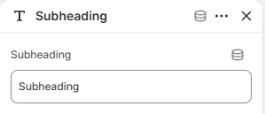
### Subheading
Displays a short subheading above the main heading.
| Setting | Description |
| ---------- | ------------------------- |
| Subheading | Sets the subheading text. |
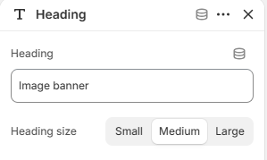
### Heading
Displays the main heading.
| Setting | Description |
| ------------ | ---------------------------------------------------------------------- |
| Heading | Sets the heading text. |
| Heading size | Controls the size of the heading. Choose from Small, Medium, or Large. |
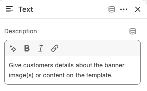
### Text
Displays supporting text below the heading.
| Setting | Description |
| ----------- | --------------------- |
| Description | Adds supporting text. |
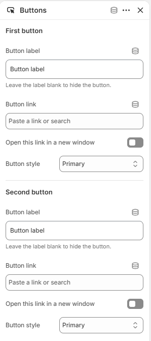
### Buttons
Adds up to two call-to-action buttons.
| Setting | Description |
| ------------------------------ | --------------------------------------------------------------------------------------------------- |
| **First button** | |
| Button label | Sets the button text. Leave blank to hide the button. |
| Button link | Selects the page or URL the button links to. |
| Open this link in a new window | Opens the linked page in a new browser tab. |
| Button style | Sets the button style. Choose from Primary, Secondary, Primary outline, Secondary outline, or Link. |
| **Second button** | |
| Button label | Sets the button text. Leave blank to hide the button. |
| Button link | Selects the page or URL the button links to. |
| Open this link in a new window | Opens the linked page in a new browser tab. |
| Button style | Sets the button style. Choose from Primary, Secondary, Primary outline, Secondary outline, or Link. |